How Illustration Style Changes What a Story Feels Like
The same plot, drawn two different ways, doesn't read the same. Research on children's book illustration shows style shapes mood, preference and even what a reader remembers.
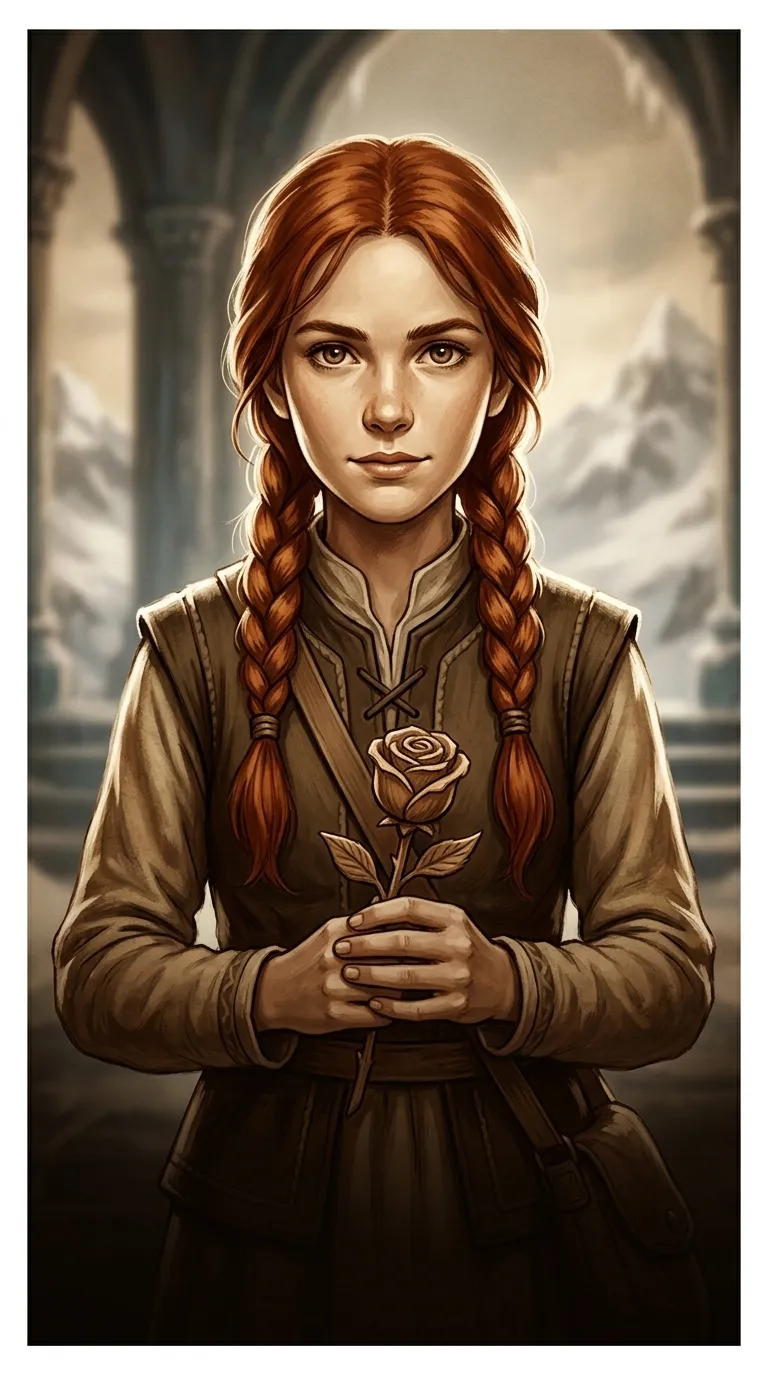
Take the same fairy tale and hand it to two different illustrators, and it stops being the same story to read. One might render it in soft, dreamy watercolor with pastel skies; another in bold, saturated cartoon lines with oversized eyes and exaggerated grins. Neither illustrator has changed a word of the text, but a reader opening either book gets a genuinely different experience before the first sentence is read.
That's because, for most readers — and especially young ones — the picture arrives first. A child looks at the art before deciding whether to read the words underneath it, and that first look already carries a mood: calm or exciting, gentle or tense, safe or a little frightening. Illustration isn't decoration wrapped around a story; it's one of the two languages a story is actually told in.
What a Controlled Study Found When It Varied Only the Art
One of the more direct tests of this came from a study published in the journal Reading Psychology, led by researcher Lauren Scharff. Seventy-one first- and third-graders were given one of nine versions of the same book, varying only in illustration style — realistic or more abstract, bright or somber — along with whether the book had text only, illustrations only, or both together. Every child then answered the same fifteen comprehension questions.
The results split in an interesting way. Illustration style on its own didn't reliably change how much children understood — a bright, realistic version and a somber, abstract version of the same book produced similar comprehension scores. What style did change, clearly and consistently, was preference: children liked the bright, realistic illustrations significantly more than any other combination. Comprehension, meanwhile, depended far more on whether text and illustration were paired together at all — children who got both did better than children who got either one alone.
Why the Feeling Still Changes Even When the Facts Don't
That finding might seem to undercut the idea that style matters — if it doesn't move comprehension scores, does it really matter which way you draw it? What the study didn't measure was mood, and that's where illustrators and editors say the real effect of style lives. A character's facial expression and posture are among the first things a young reader reads for emotional information, well before they're reading the sentence describing how that character feels. Color carries its own signal on top of that: brighter, warmer palettes tend to read as energetic or safe, while muted, cooler tones read as somber or unsettled, and a mismatch between a story's actual tone and its illustration's mood can leave a reader quietly confused about how they're supposed to feel about a scene.
Medium adds a further layer. A soft watercolor wash and a hard-edged cartoon line can depict the identical scene — say, a child walking into a dark forest — and produce two different emotional registers: one dreamlike and a little uncertain, the other brisk and safely exaggerated. None of that changes what happens in the plot. It changes how the plot lands.
Choosing one style and keeping it
The practical challenge this creates for anyone illustrating a full book, not just a single picture, is consistency: a story whose art style drifts page to page — one spread painterly and soft, the next flat and cartoonish — asks a reader to keep resetting their sense of the story's mood. WonderBooks illustrates each story with one consistent visual style held across every page of that book, so the mood the art sets on page one is still the mood carrying the reader on the last page.
That's a matter of craft, not a claim to have solved what researchers are still studying — style's effect on mood is well observed by illustrators and editors but harder to measure precisely than comprehension is. What's not in dispute is that the choice gets made one way or another on every illustrated page, and it shapes what a reader feels before they've read a single line.
Frequently Asked Questions
Does illustration style actually affect how well kids understand a story?
Not much, according to the closest controlled test of it: a study in Reading Psychology found that varying illustration style (realistic vs. abstract, bright vs. somber) didn't reliably change comprehension scores. What did affect comprehension was simpler — whether children had both text and illustrations together, rather than either alone. Style's clearest effect in that study was on preference, not understanding.
Do children prefer certain illustration styles?
Yes — the same Reading Psychology study found first- and third-graders significantly preferred bright, realistic illustrations over somber or more abstract versions of the identical book. Preference and comprehension didn't move together, though; the style children liked best wasn't the one that measurably helped them understand more.
Why do illustrators keep one consistent style throughout a book?
Because style carries mood, and mood that shifts page to page — soft and painterly on one spread, flat and cartoonish on the next — makes it harder for a reader to hold a stable emotional sense of the story. A single consistent style, even a simple one, lets the art support the story's tone continuously instead of resetting it every few pages.